
The goal of this project is to understand HTML and CSS, two basic coding languages used in web development. In order to demonstrate how they work, I made coding tweaks to two websites, one for mobile view and one for desktop view.
I started with the mobile site, and decided to do minor tweaks to the above the scroll portion. I chose to do the Fueled By Ramen Record label site as it has a lot of empty space, a bright background and hard to read text.
below is the unedited page.

The first thing I changed was the background color. I kept the teal, but made it darker to make the white text and icons more legible.

The next thing I had done was change the padding between their header image and the text.

I then changed the margin of the header, so it was aligned to the body copy.

Next, I made two changes to the body copy. One was the copy size, and the other was changing the content of the copy, as the original was hard to read.

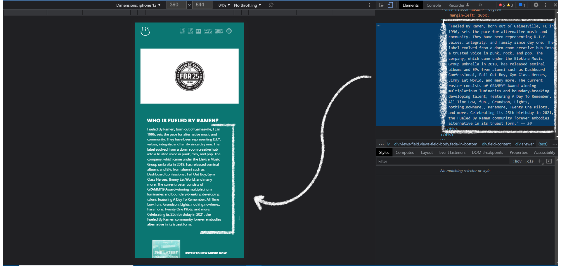
I then changed the padding of the image again as it was still too much with the larger text.

The last change I made for this site was the padding between the copy and the new music image link.

For the desktop site, I chose to do the HUNNY about page. I also made minor tweaks in this page with spacing, text size, and colors.
below is the unedited page.

I started with changing the padding on the right of the site content, to get rid of some white space.

Then I added more space between the two sections of text by adding padding to the left of the column on the right side.

I added space below the band's logo in the top left corner by adding padding below the graphic.

I then evened out the space above the text portions by adding padding above the side column to make it in line with the rest of the page content.

After that, I lowered the padding to the content portion of the site to reduce the amount of white space between content and header.
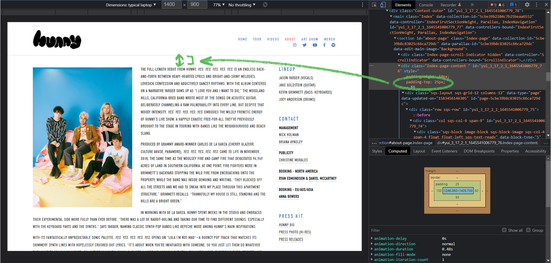
The next change I made was the background color. I chose to do a tint of the blue text to keep a consistent color scheme.

Then I increased the text size for the body copy and the headers of the content.


Next, I increased the text size of the navigation menu to match the text increase in the content portion of the site.

The last change I made was adding space between the social media icons and the navigation menu by adding padding to the top of the icons.
