Accessibility is important to websites to make sure that a site is inclusive and useable for as many people as possible. This means sites feature things like alternative descriptions of images for the visually impaired, high contrast for legibility, and easy to read text.
SEO, search engine optomization, is also important. It allows search engines like Google and Bing to find a site. With better SEO, sites can be featured higher in the search results.
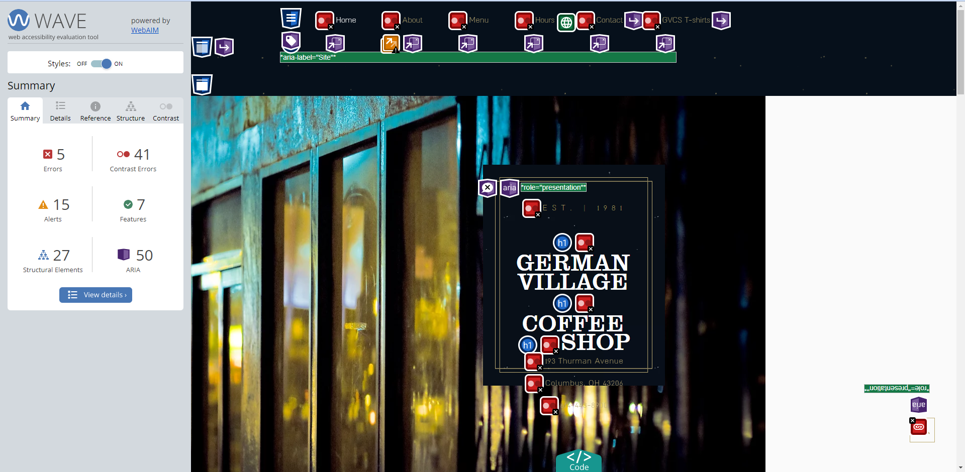
In order to assess both Accessibility and SEO, I used two tools. The WAVE Chrome extension, which looks for possible accessibility issues like missing alt text and contrast. The other tool I used was Lighthouse, which grades sites on accessibility and SEO, and points out issues in both areas.
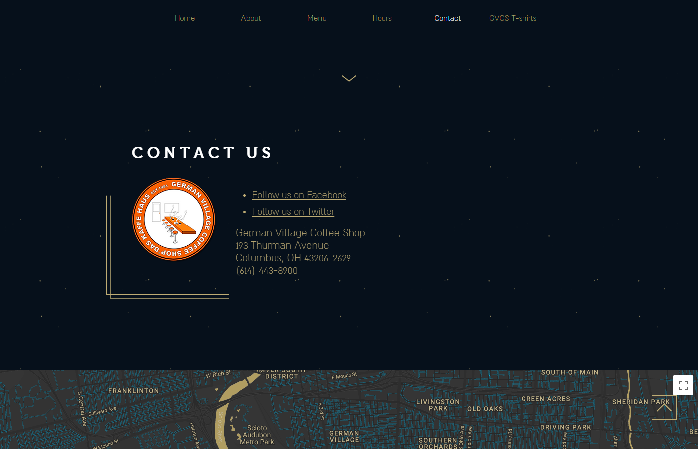
The first site I tackled was the German Village Coffee shop.


After running both lighthouse tests and WAVE tests, the main issues they found that I chose to address were contrast, tap targets, alternative text, and adding a meta description.

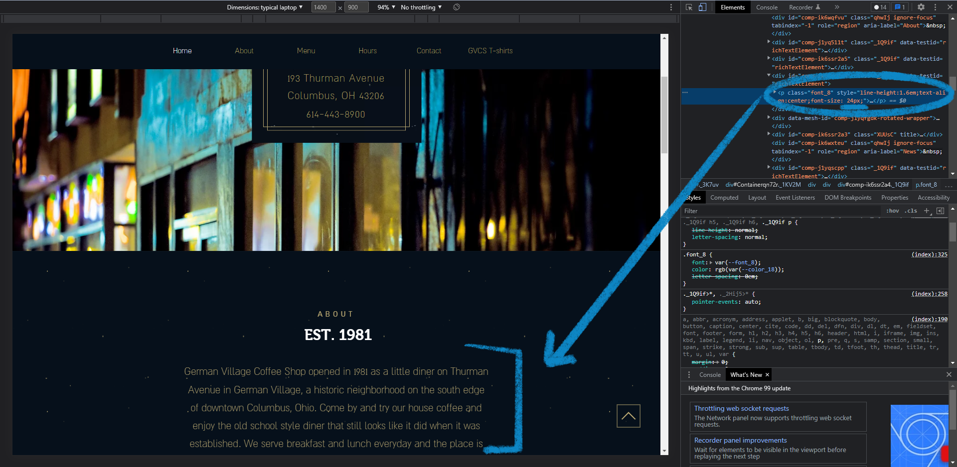
In order to fix contrast, I first looked at the text colors. The colors themselves had enough contrast, however the text size made the body copy hard to read.

The first change I made was enlarging the text size in hopes to create enough contrast between the text and the background color. The original text size was 18px and the increased text size is 24px.
I then addressed the tap targets. The two social media links needed to be larger and a bit farther apart so that the intended link can be clicked. I increased the text size from 18px to 22px, and added some top padding to the lower link to further separate the two links.

The last two fixes are SEO fixes. I added alt text to the images included on the home page. If the image does not load or the viewer is visually impaired, they know what the image is. The image is also now searchable in connection to the website.

The other SEO fix I made on this first site was adding a meta description for the page. This copy provides a small description of the site for users on search engines. This can also help users find the site with keywords used in the description.

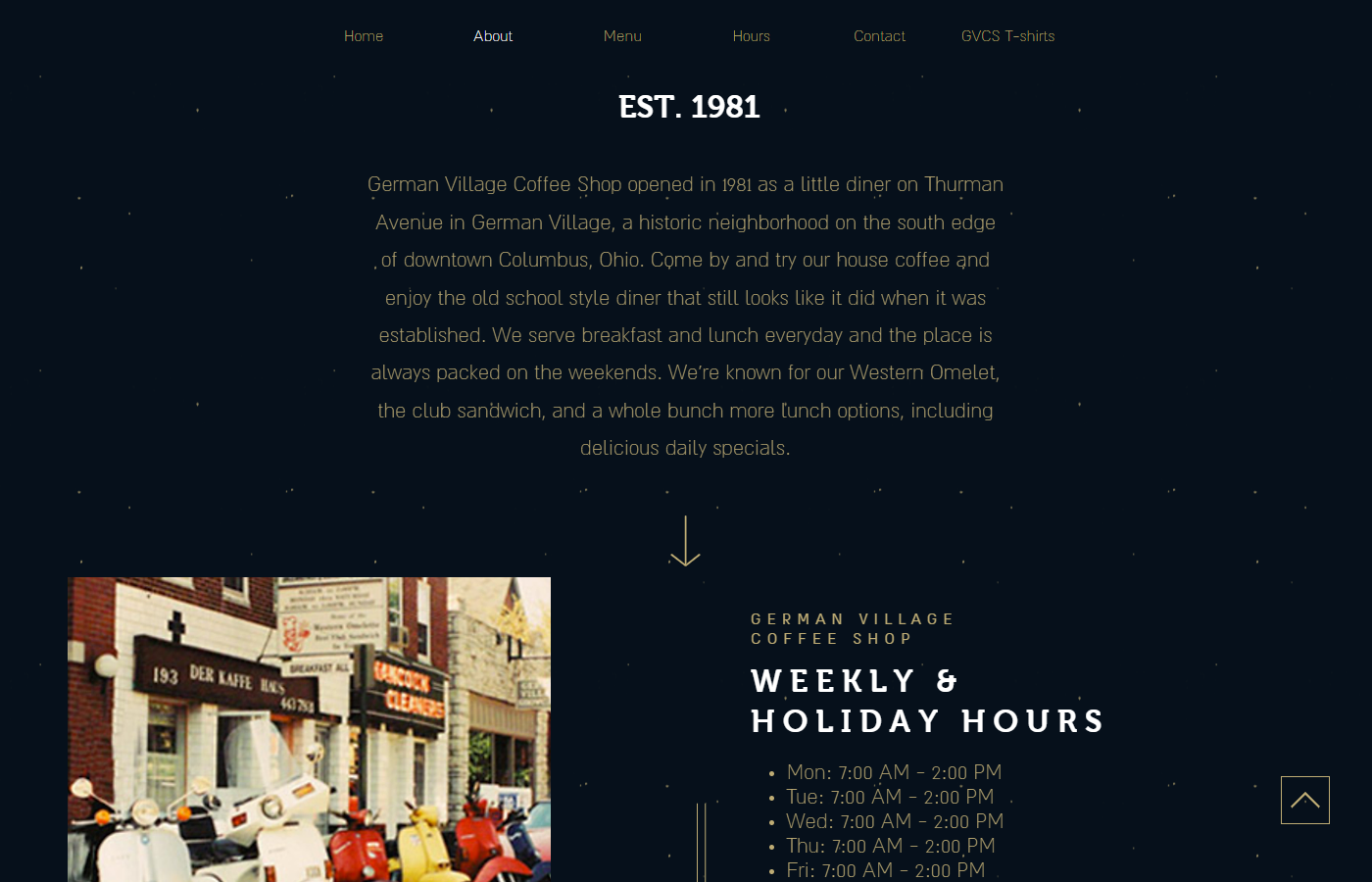
With all these changes made, the only visible changes are the text size and tap target changes. Below is the final visible changes to the site.

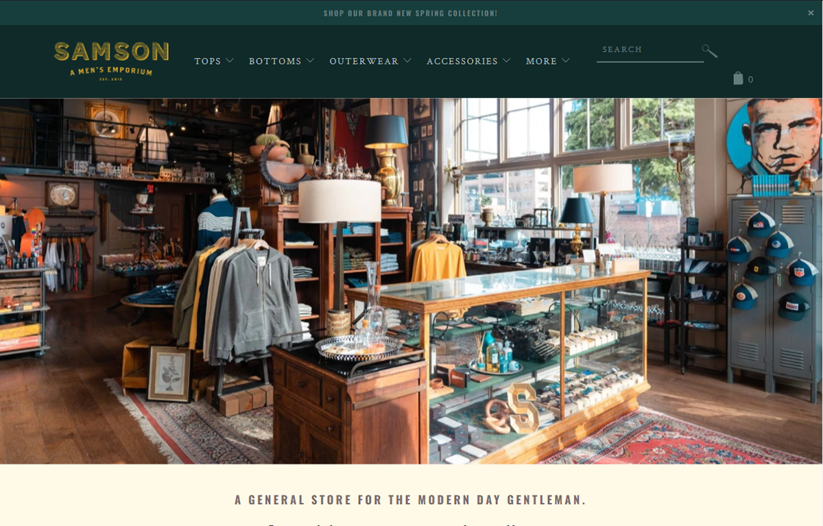
The second site I tackled was for Samson, a men's clothing and accessory shop.
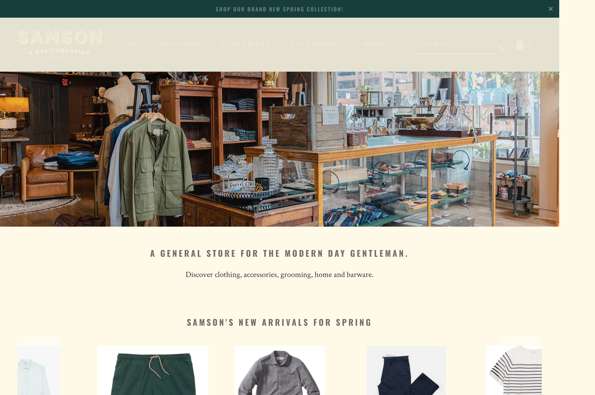


After running both Lighthouse and WAVE tests, I found similar issues. For this site I will addressing the text contrast issues, both in color and size, as well as SEO issues like alt text for images and alt descriptions for links.


The next test I did was checking the contrast for text on the green background. The original text color is too dark and does not provide enough contrast. In order to fix this accessibility issue, I made the text color lighter, increasing the contrast and legibility.


The next accessibility change I made was increasing the text size on the bottom menu, as it was still difficult to read even with higher contrast between the text color and the background color. The text was increased from 16px to 20px.

The last two changes I made were both for SEO and accessibility. I had added alt text for a clickable link incase the image associated with the link does not show up, or in case the user is visually impaired. This also fixes the SEO issue that connects that link to the content, so the link is definitively connected to the tops that appear when the image is clicked.

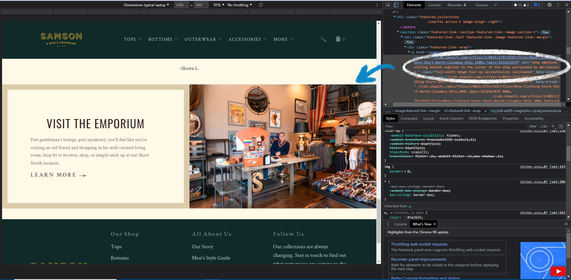
The other SEO and accessibility change I made was changing alt text for an image about the shop. The original alt text was labeling the image as "Visit the Emporium" which does not accurately describe the image. This also allows for users possibly looking for an image of the store to find one using the image description.
The final visible changes for this second site are below.